Deployment Project REWIND!!!!
Revisiting Project #89
Time With HGTV's Terry Haas
**This post still has a few for Terry to look at, but I want to post this before I pick up the hubby tomorrow. Not sure when I will be back on here since we will be so happy with him home***
A couple of weeks ago I gave everyone a chance to get involved in one of my deployment projects.
(You can read about it HERE)
In a nutshell, my friend, Terry Haas, who is one of the real estate experts on HGTV's show "Designed To Sell" graciously accepted me begging and pleading on my knees to help me out with this deployment project.
I asked my blog readers to send in a photo of any room you wanted some advice on....and Terry would give you her thoughts on improving your space.
Receiving your photos was so much fun!!! I loved seeing that there are others out there who struggle with the "what on earth do I do with this room" syndrome. Reading through Terry's comments I was able to take some of her advice for my own home, and I hope you will find her as helpful as I did!
So, let's see what Terry had to say about these spaces.....(everything you see below the pictures in green are Terry's words)
#1
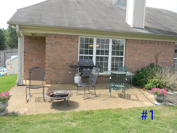
This is a great space that has 0 "wow" factor. This is a perfect opportunity to build essentially another room to the house. I am not sure where this home is located but it looks like nice weather and spending time outside would be nice.
The grass is green, you have a good sized space, furniture is already there etc.
This may be a great spot for a pergula or something that provides shade.
I am not a fan of the big slab of concrete but there are lots of fixes that are reasonable in price. This would dress it up and not make it so cold.
Tile, stamped application, and adding some landscaping would make it less "harsh". This is an entertainment space-you want to make it inviting. Add colored plants/containers, easy to build shelter that could house creeping vines, soften the hardscapes. This is an extension of the home, make it fun!
#2 and #3
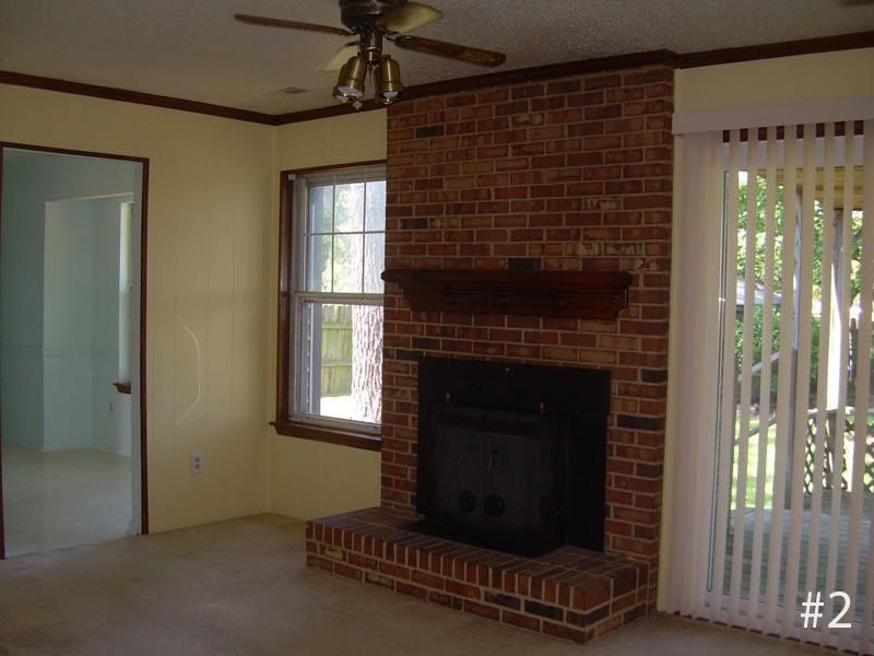
This room has lots of potential. The brick is pretty and the room is a blank slate. The problem is that the feel is dated. The yellow is cheery but not warm, the brick is functional and but not a "cool retro look" to it. It is just brick. And I have no words for that metal piece on the front--yikes!
We need to warm it up, bring it up to date, and get this room out of the 70's!
In the effort to keep cost down, let's use what we have. Good space, fireplace, natural light. If we warm up the color, maybe a creamy beige, it will warm up the space. The fireplace could be "cool" if it was not the brick color. Paint it white and then see if we can break up the massive brick space with a mantle that ties it all in. Find a fun piece of art for above the mantle or even some decorative candles or statues to bring in some "life". How about a big clock?
The lighting/fan is screaming "outdated". If the ceiling could handle recessed lighting or spot lights it would be awesome. Lighting can make or break a room of snuggle factor.
Also, lets do something with the windows. The blinds are not cutting it.
Some kind of window treatments that drape and add color would be pretty or even sheer panels to keep the light from being blocked. Depending on the budget, what about changing out the slider for a set of french doors?
As far as flooring, can't really tell by the picture but what about hardwoods or even a more cost effective area rug?

#4,5 and 6
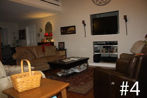
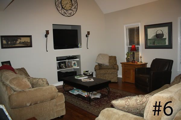
This room is just "missing the mark" on alot of levels.
Great space but nothing is working together to make it feel like a fun room to play in.
The large abyses cut into the wall are not working. They are there but really look like they just cut holes in the drywall and stuck in the tv/shelves.
What about building bookshelves around the entertainment space? This is a big wall and does not look finished.
What is going on with those sconces on the wall? They have no candles/lights, they are just there.
The decorations are pretty dated. I am not kidding you when I say that my mom has/had the exact same basket picture several years ago.
There are plus's that we need to highlight: Look at those floors! Beautiful. Suggestion would be to pull up the rug--you are hiding the floors and actually making the room look smaller.This room is just "missing the mark" on alot of levels.
Great space but nothing is working together to make it feel like a fun room to play in.
The large abyses cut into the wall are not working. They are there but really look like they just cut holes in the drywall and stuck in the tv/shelves.
What about building bookshelves around the entertainment space? This is a big wall and does not look finished.
What is going on with those sconces on the wall? They have no candles/lights, they are just there.
The decorations are pretty dated. I am not kidding you when I say that my mom has/had the exact same basket picture several years ago.
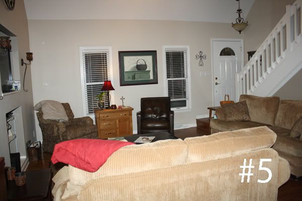
You may also want to consider removing some of the furniture. Each piece is mismatched and doesn't look all that inviting.
Open up the flow of the room and create a walkway from front door to dining area.
Hard to walk around the couch.
Maybe get rid of the two chairs and use the couches across from one another. This would make for a better conversation seating arrangement.

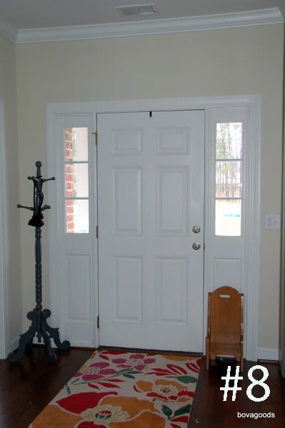
(Elisabeth from Bovagoods sent in a question with her photos....
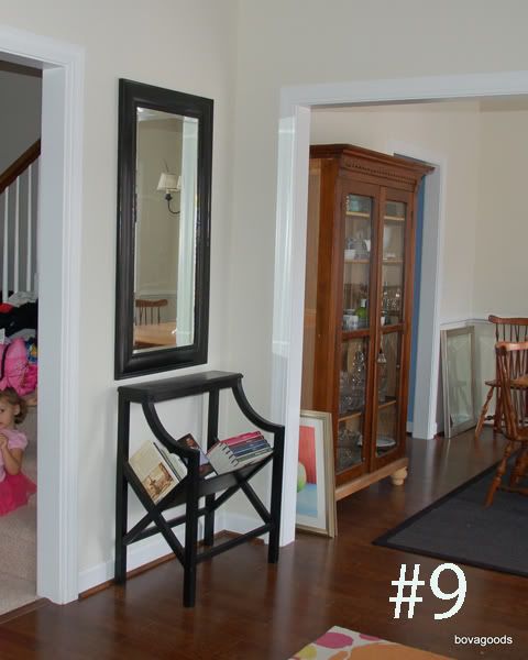
"The designer in me wants to make this boring space snazzy. In my opinion, you can be more bold in a small space because, well, it's small. This is a foyer, so it's not like we are spending a ton of time in here. Thoughts of painting the interior of the door black, adding a fun light, wallpaper or stenciling the walls dance in my head. Am I crazy? Will I have to paint it beige again if we decide to sell? How snazzy can I get in here?" #8 & 9
You have to enjoy the space you live in while you are there--whether you are a creative nut like you or someone who collects something. Enjoy your home but be prepared to "beige it up" prior to selling. Keep the old light fixture and put it back up to save some bucks when getting ready to go on the market.
And just for the record...no wallpaper!
Paint is easy to change. Wallpaper is a guarantee to have to come down. Don't make extra work for yourself.
Have fun with it.
#10
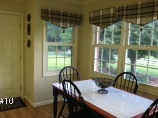
Beautiful lighting from the windows. Love the bay window to open up the room.
The table makes no statement for the room. Chairs look tiny and this is a perfect spot for some fresh flowers.
In the pictures the room appears to be a creamy/buttery yellow color. Dated. Warm it up and add a bit of color. Perhaps a soft blue/slate or even just a warm beige. (check out Latte from Restoration Hardware www.restorationhardware.com)
I don't care for the valance at all. I truly would not cover these windows but for privacy you may want to consider 1/2 plantation shutters. Will also add value when you are ready to sell.
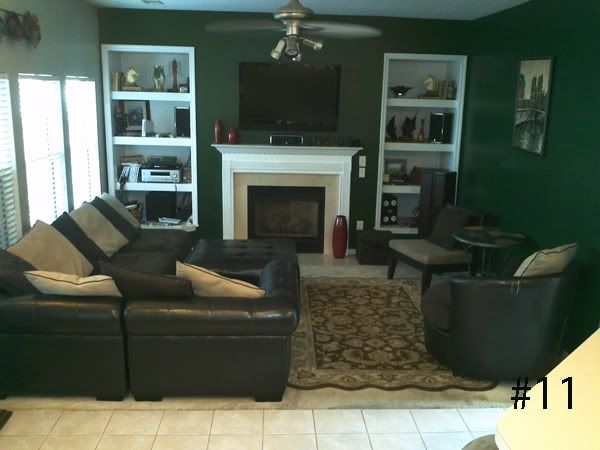
#11
Whoa! That is alot of green...too bold/dark and making it feel very small. One monotone/neutral color would make this one big space.
This could be a really nice "great room" or family room but...
One of the largest issues is the break in the flooring. We go from tile to carpet and completely cut off the flow of the room
My first choice would be hardwood flooring in both rooms to bring it all together. This would update the look, make it look bigger, bring the two spaces into one and most importantly, add value.
The furniture is much too large for this space. Even if you were to remove some of the sections of the couch it would open up the area.
You want this to be a place where people can sit, talk, be engaged/entertain from either room. The oversized couch is the biggest "guest" in the room.
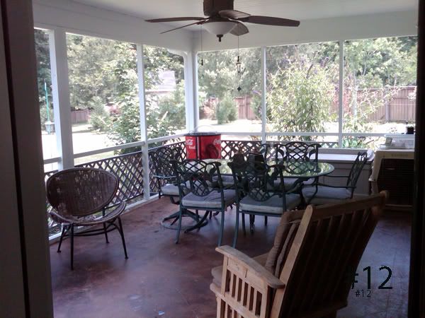
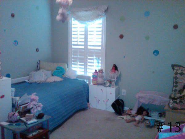
#13
This room is really odd. I don't understand the random colored circles on the wall. I am not sure the age of this young lady but there is no direction to her room. There is alot of "baby" still happening and then the darker colored dots.
Feel like she got all of the left over furniture with nothing coming together.
Depending on her age, make it fun and age appropriate but something she can grow with. Much more cost effective and easier on the wallet.
Bold stripe, or if you like the polka dot idea, there are great patterns out there where the dots can be incorporated but not be so random.
Pick 2 or 3 colors and pull pieces into it.
Mix textures and patterns to give it some depth.
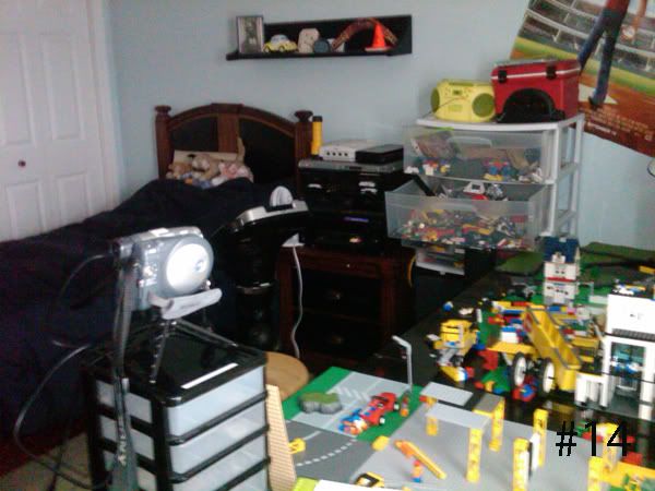
#14
Too Much everything.
The table is too big for the room--consider swapping out for smaller that would do the same function
In general--de-clutter and give this room some "room"
I like the bed and the dark wood base. But hard to see with all of the "clutter"
Too Much everything.
The table is too big for the room--consider swapping out for smaller that would do the same function
In general--de-clutter and give this room some "room"
I like the bed and the dark wood base. But hard to see with all of the "clutter"
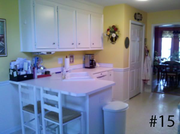
#15
Warm it up! There is so much white in here that it feels cold. The kitchen is supposed to be comforting and inviting.
Consider warming it up with a beige (granite) countertop. Even the barstools blend in.
You could easily use a colored or patterned cushion to give it some depth. Lighting will also make a big impact.
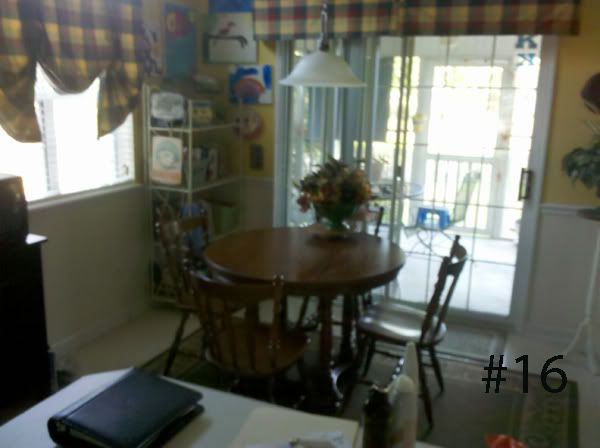
#16
Really good space but way too much happening. Less is more here too.
Remove the bakers rack-just collecting stuff/clutter.
Take down the plaid valance--dating the look of the room
I would remove the rug. You are making the room look smaller.
Remove the bakers rack-just collecting stuff/clutter.
Take down the plaid valance--dating the look of the room
I would remove the rug. You are making the room look smaller.
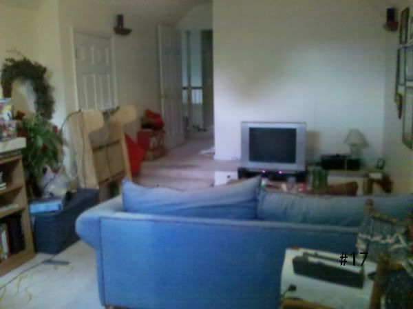
#17
This could be an awesome space that is being totally wasted. Just filled with "storage" items and not very welcoming at all.
This has the potential to be added value to to the home as well. If it shows like a useful room that the family can enjoy--
There is a perfectly good couch/seating area. Place the television on the wall and consider moving the couch to open up the space.
Can just be set up to be a good "snuggle" room for a movie night or reading a book.

(refer to #15)
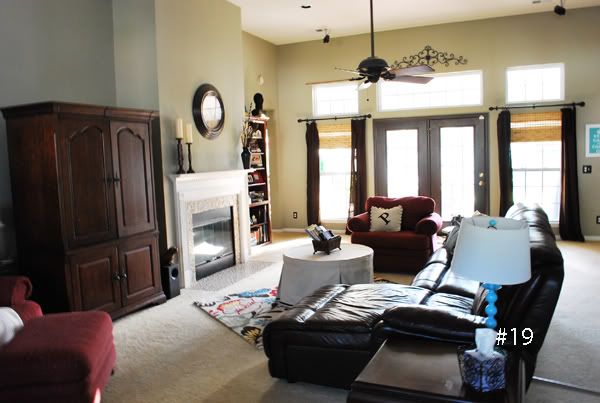
#19
Honest to goodness...I feel like I have been in this room!
Nice open space
Great natural light.
Beautiful pieces of furniture and nothing is coming together.
It is clear to me that this homeowner has good taste--look at the cool rug and the funky blue light.
I think the biggest problem is the armoire.Too bulky and "heavy" for this room. If this is where you are housing the television, consider getting rid of and mounting tv above fireplace. Will completely change dynamic of the room.
Stick to neutral drapes--kind of sticking out like a sore thumb.Breaking up the wall.

No comments:
Post a Comment